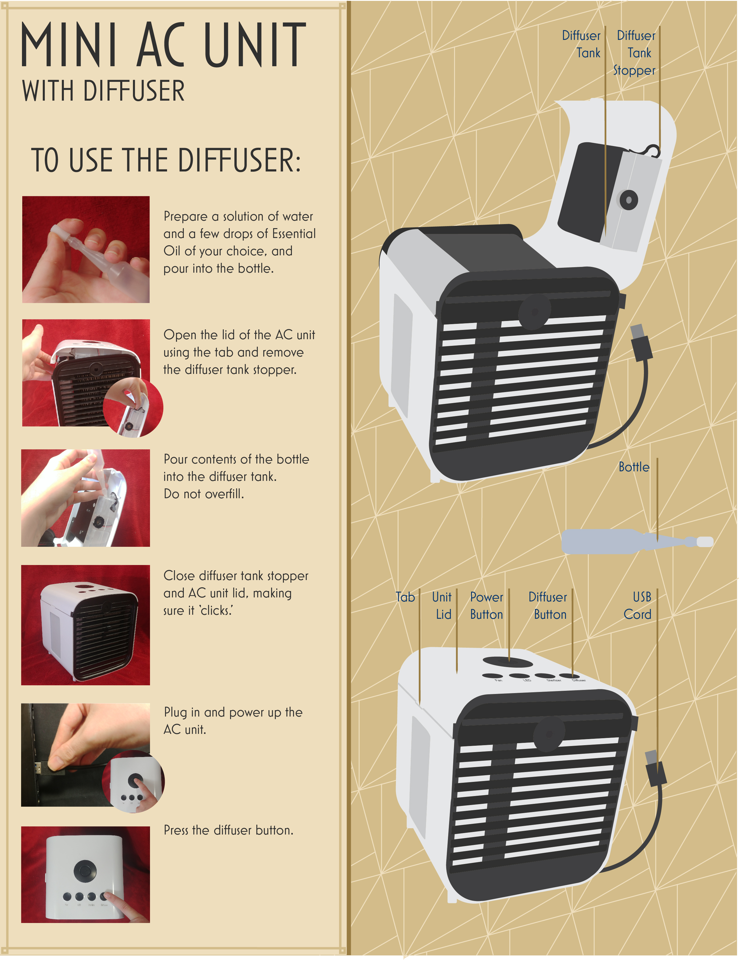
The Object & Objective
The object I thought I would have the most success with for this project was a little AC Unit I kept on my desk. It's only about one hand's length wide, long AND tall, and is relatively simple to operate. With the object selected, I could break down what I was going to be instructing. I chose using the diffuser option on the unit, and eventually broke it down into these 6 steps:
- STEP 1: Prepare a solution of water and a few drops of Essential Oil of your choice, and pour into the bottle.
- STEP 2: Open the lid of the AC unit using the tab and remove the diffuser tank stopper.
- STEP 3: Pour contents of the bottle into the diffuser tank. Do not overfill.
- STEP 4: Close diffuser tank stopper and AC unit lid, making sure it ‘clicks.’
- STEP 5: Plug in and power up the AC unit.
- STEP 6: Press the diffuser button.
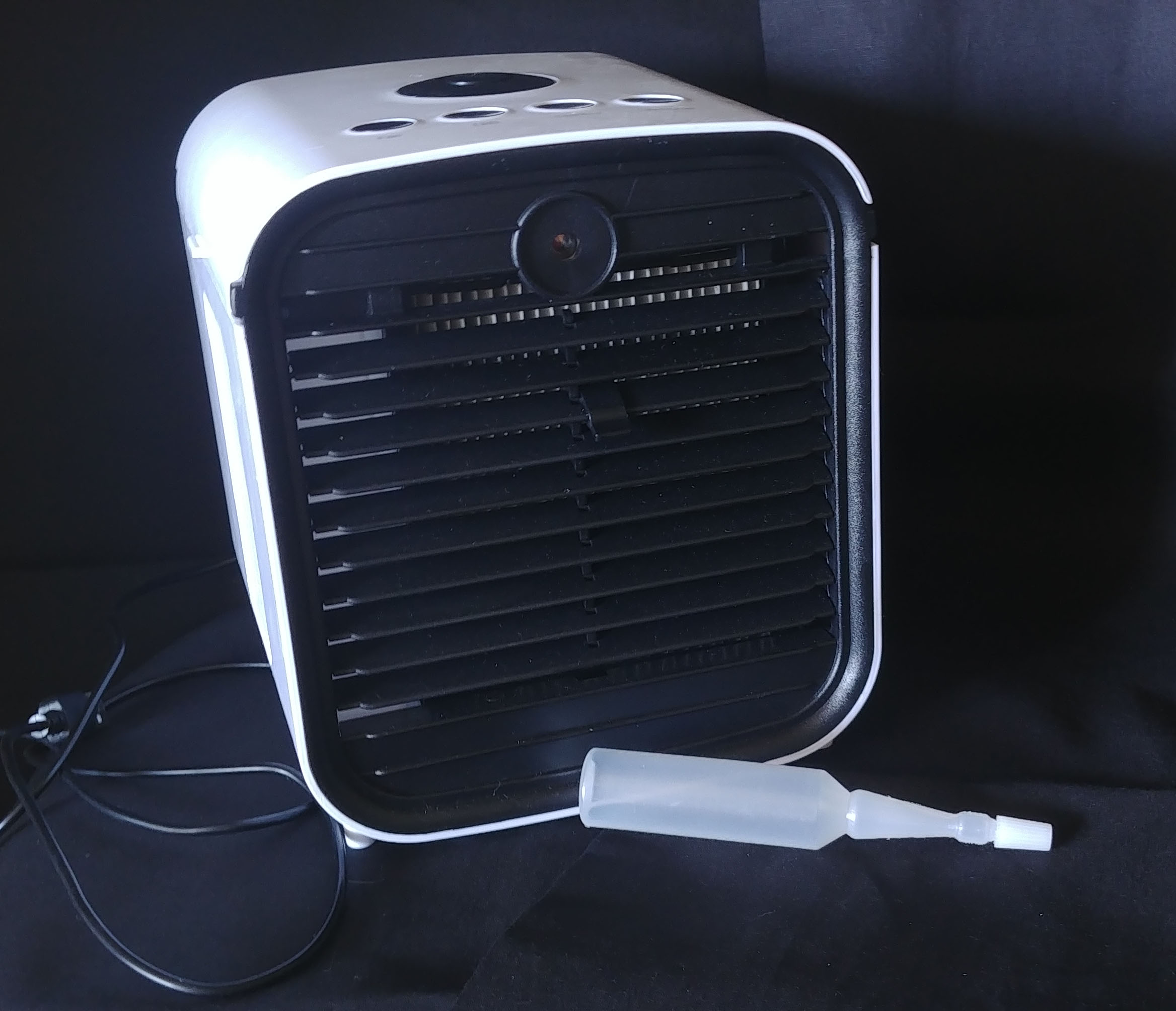
Originally, I took a multiude of pictures of the unit from all angles and with all manner of hand poses doing various things (pressing buttons, opening lids, etc) on a neutral black background, but after a round of feedback and some crititical inspection on my part, I retook the photos on a lighter background so you could actually see what was going on. The black grill of the unit nearly always got lost on the black background.
Layout
I played with a lot of layout styles. I wanted the final layout to be something different than the 'norm' or 'expected' layout, but I also felt like I had a lot of information I needed to display and not a lot of space to display it.
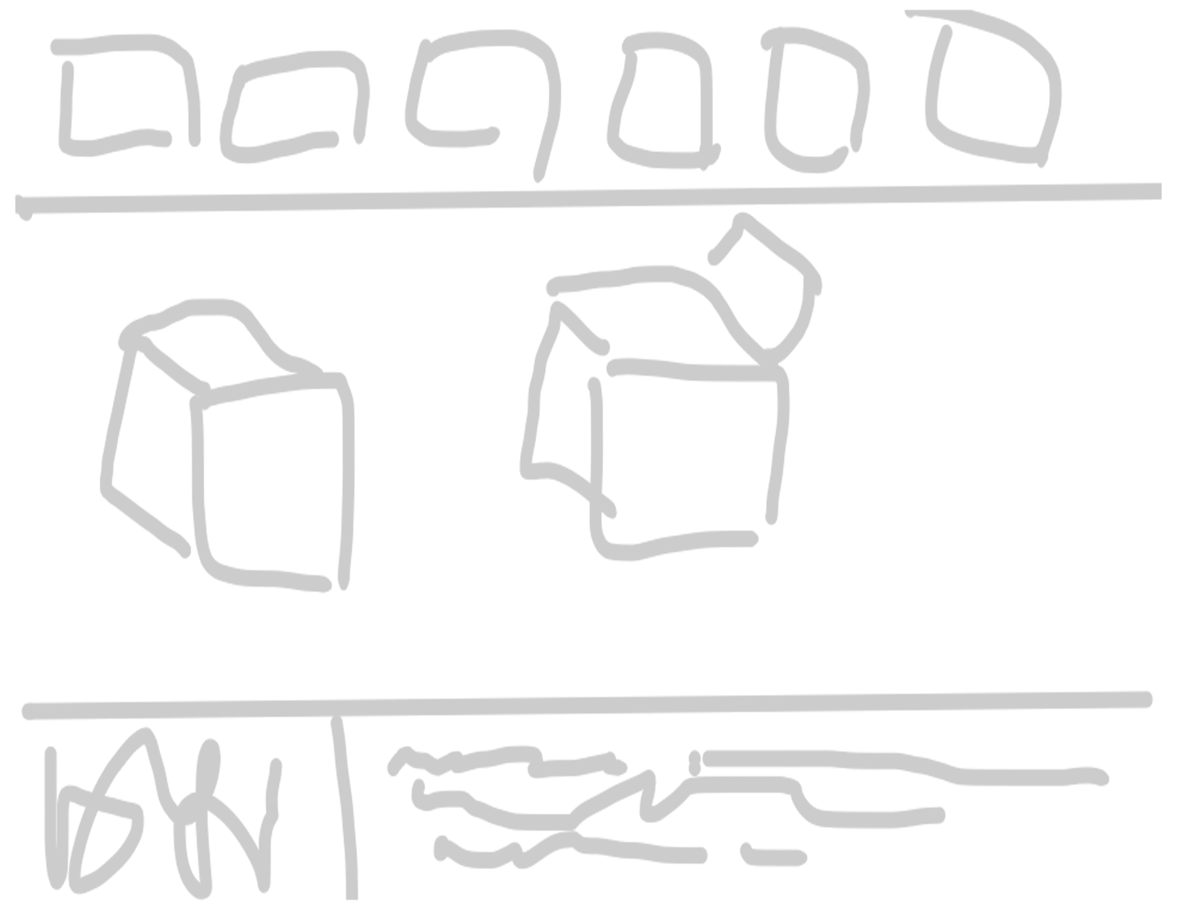
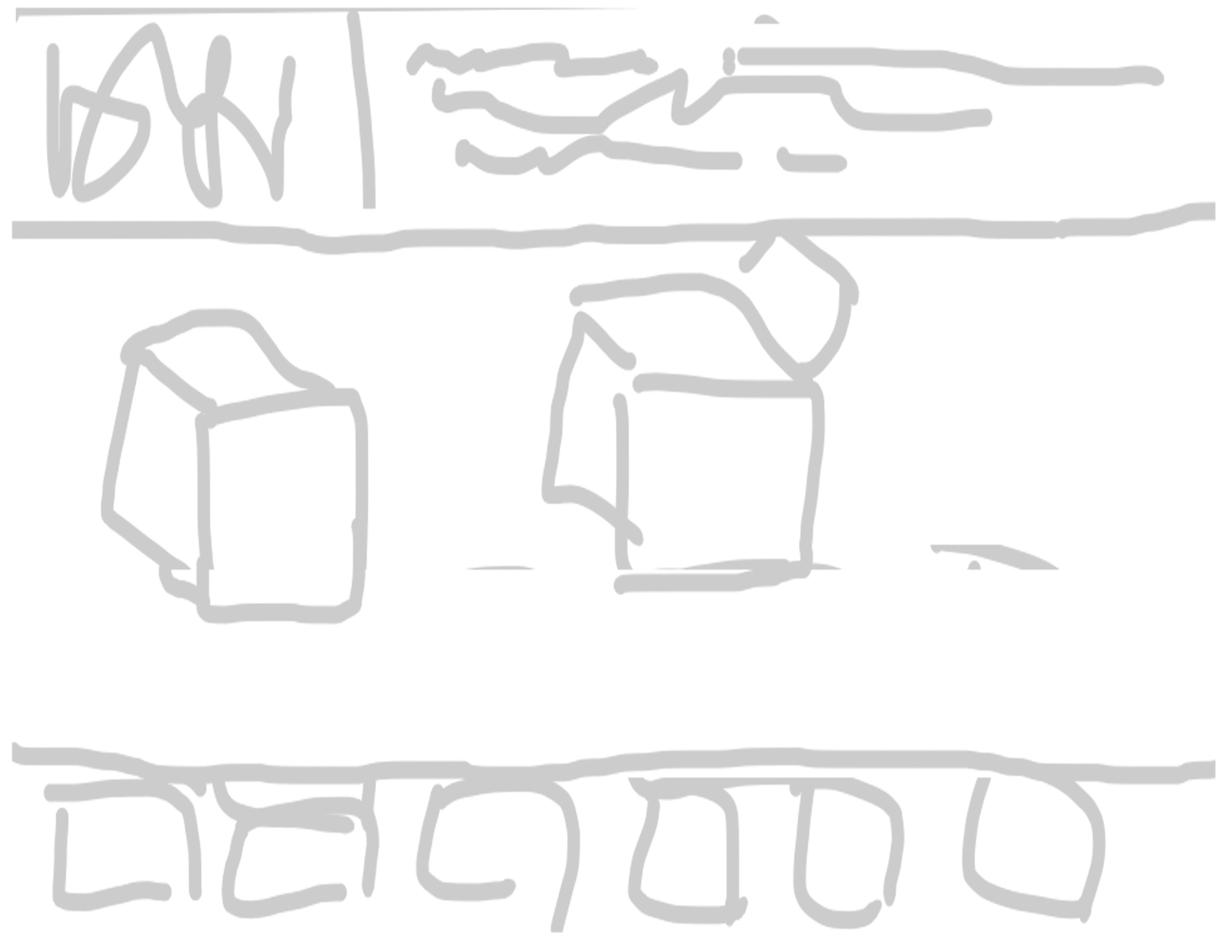


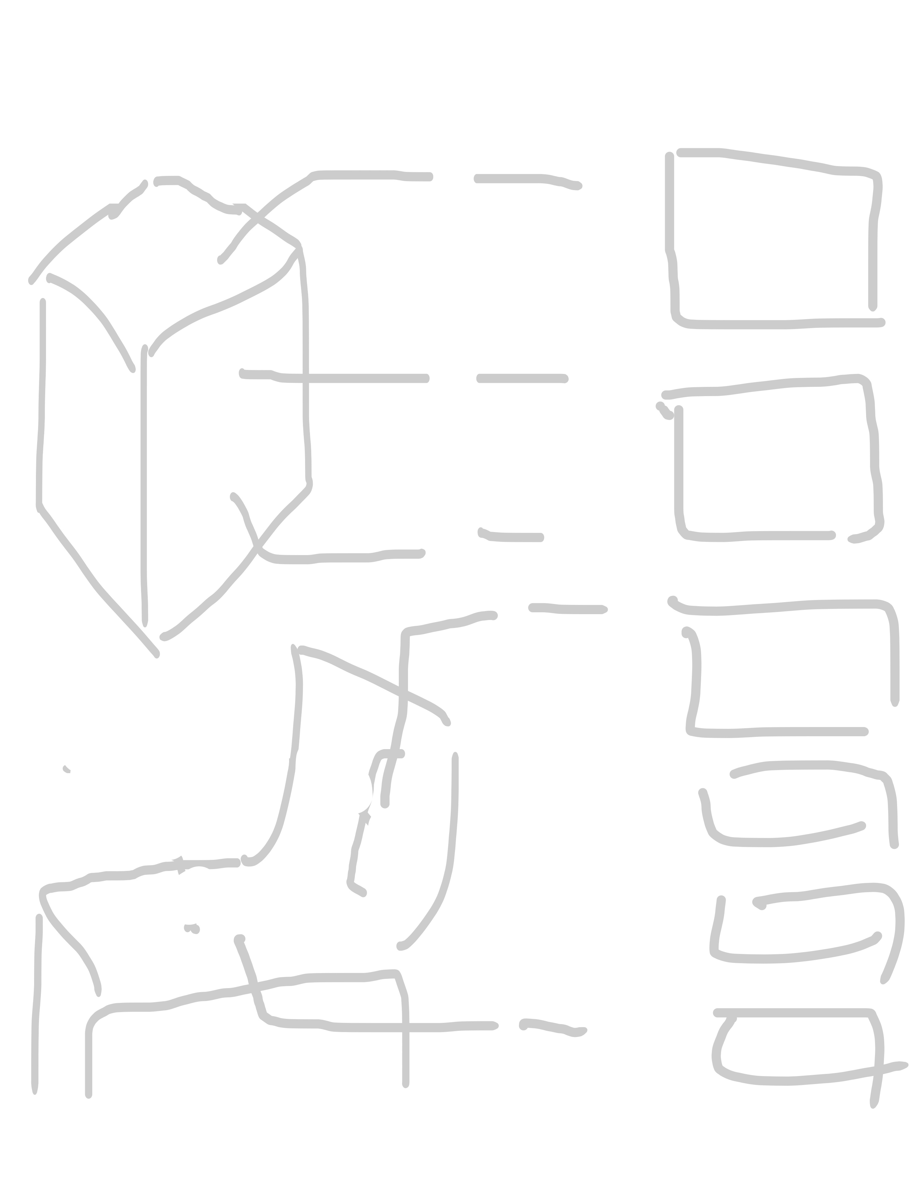

While some of these layouts looked nice, they didn't leave me a lot of room for what I needed to include, so I decided to go with a simple two column layout in the end.
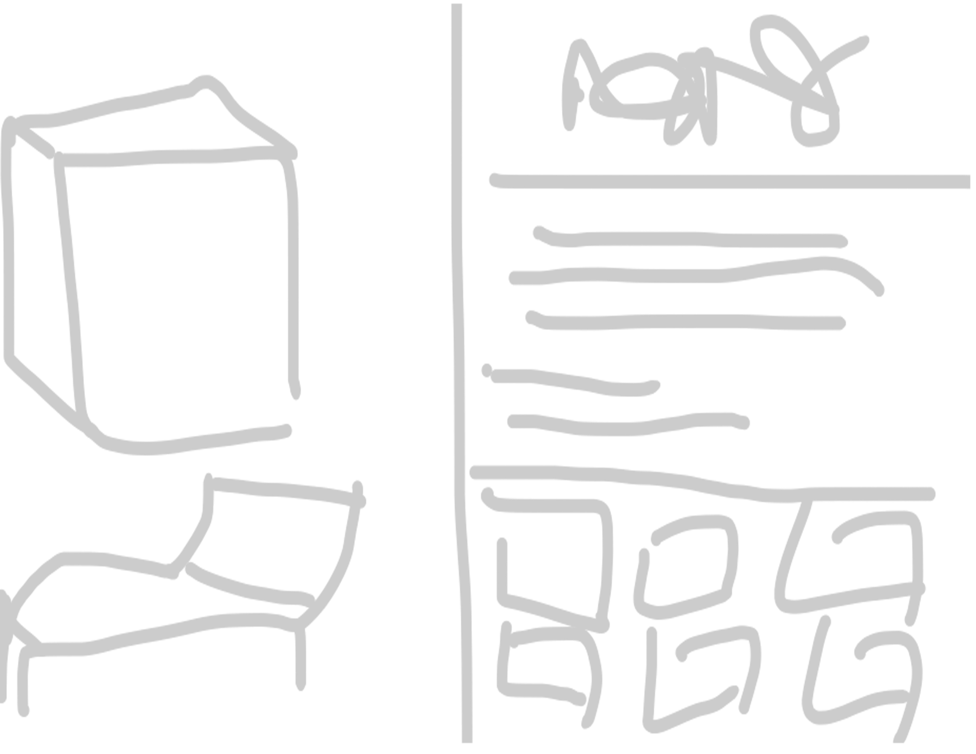
Fonts & Colours
This was the part that took the longest. Since the object is black and white, I wanted a colour scheme that made it a little less boring to look at, but that also wouldn't get lost or obscure any of my text. To test them, I made tiles with the unit, a font with colours from black to white, the font colour I chose, and different swatches of colour that would be used for the arrows to check contrast and visibility.
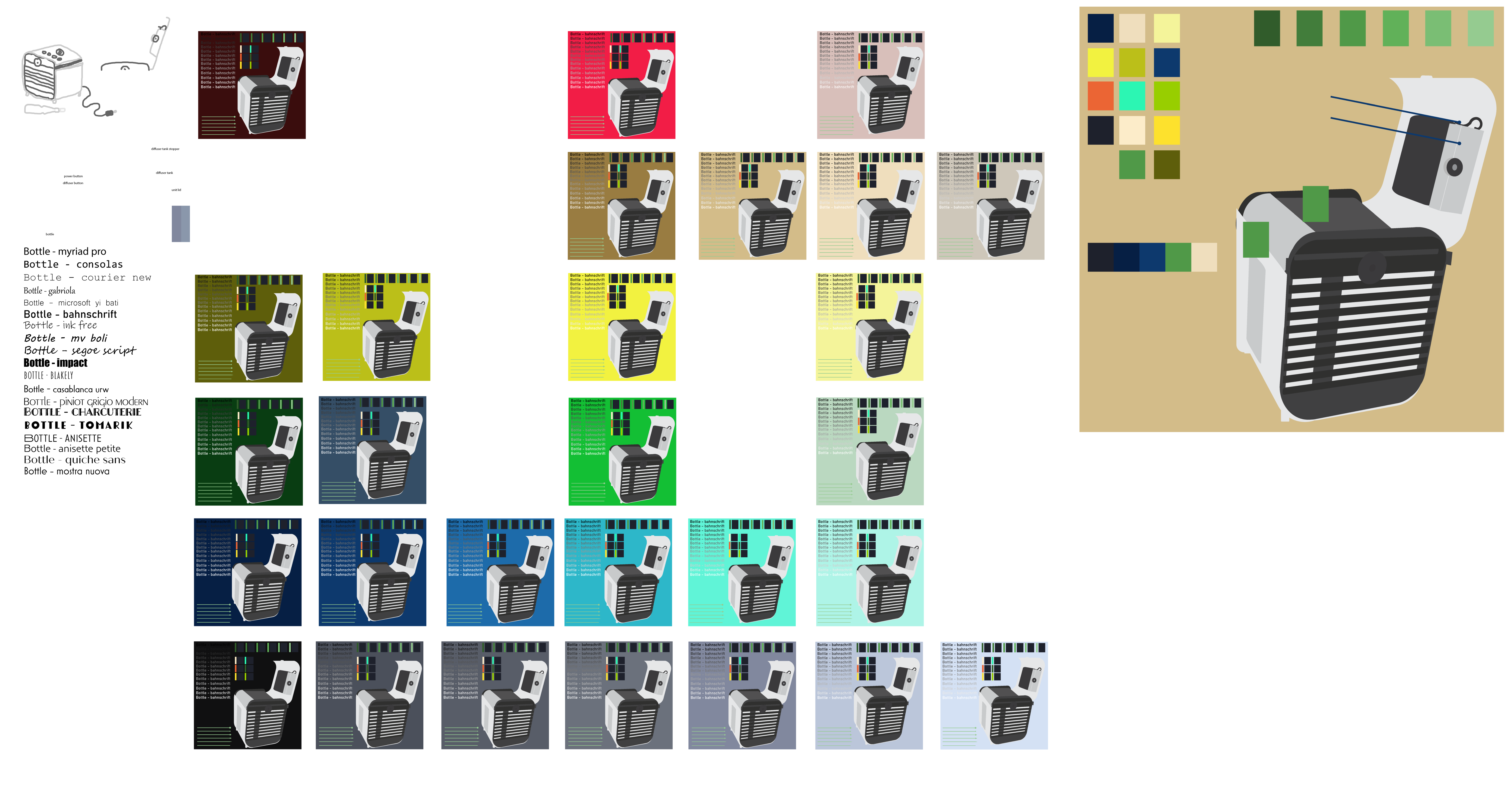
(Image opens in new tab)
I had also decided that to spice it up a little and add some visual interest, the infographic would be done in the Art Deco style. I surfed around and found a ffew fonts that fitted the style, and comapred them on the side for legibility and contrast.
The Final Piece
With everything decided and all figured out, it was time to put it all together. Below is the final infographic (image opens in new tab).